
Dance Company Logo
Client Feedback
Jazlyn came to each session with multiple ideas based on the information I provided and always had an open mind in the process. Even though my information and vision was vague in the beginning, she had suggestions and examples to explore to help me better settle on my vision throughout the process. Jazlyn really strives to understand what your vision is - or to help you better define what your vision is if needed - and to get to a result you are happy with by the end. Jazlyn is so warm, friendly and genuinely excited to bring your creations to life through collaboration!
- Lachan Niedbala, MRDC Founder & Director
Movement Reservoir Dance Company is a modern dance company seeking to bring high-quality dance to the Central Michigan area and provide a safe space for artists to be themselves, grow, and express dance through curiosity in movement.
Personality: Friendly, Creative, Confident, and Safe
Concept: Community Impact with Dance Art
Archetype: The Creator, The Citizen
Values: Acceptance, Appreciation, Curiosity, Respect, and Creativity
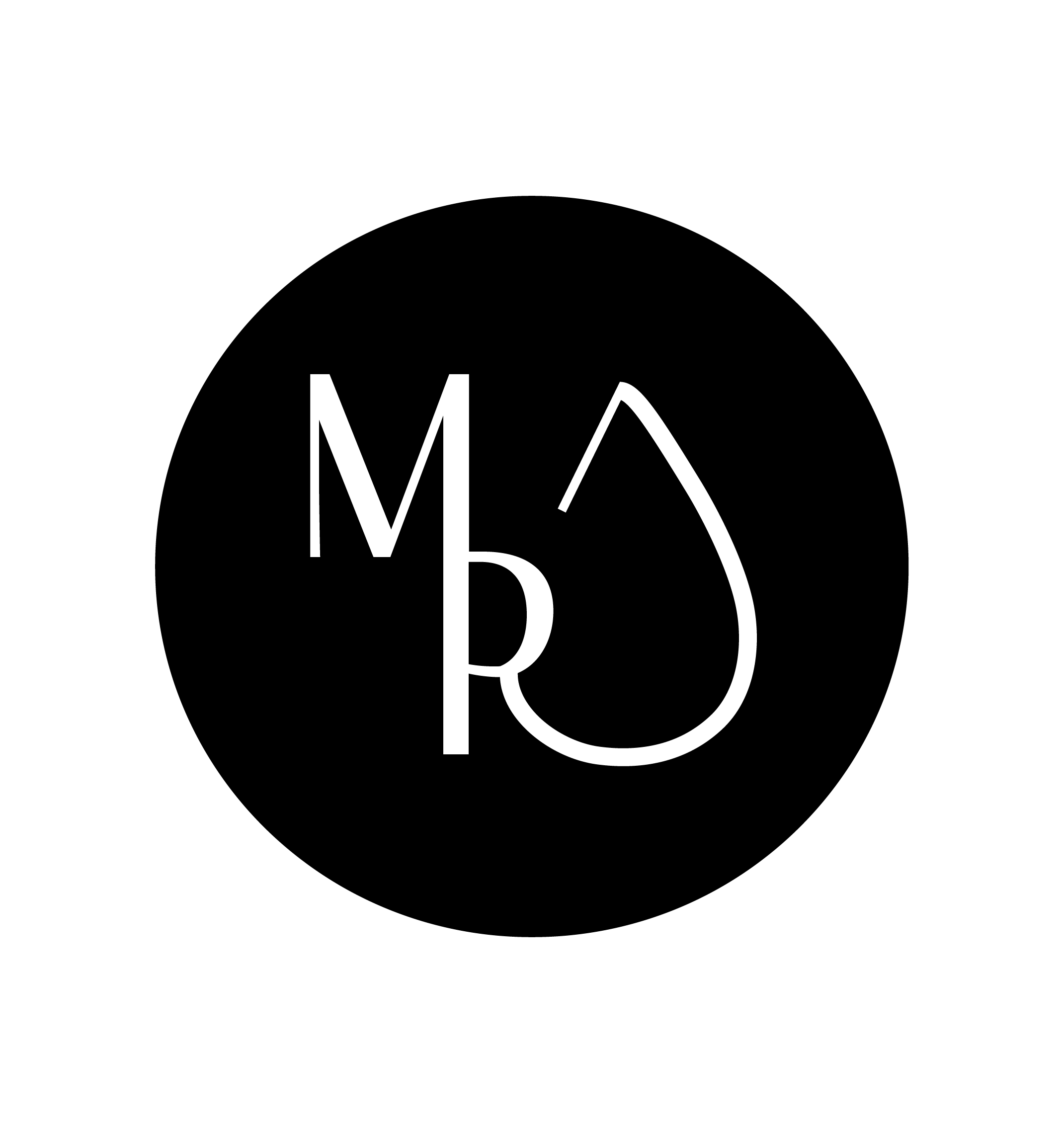

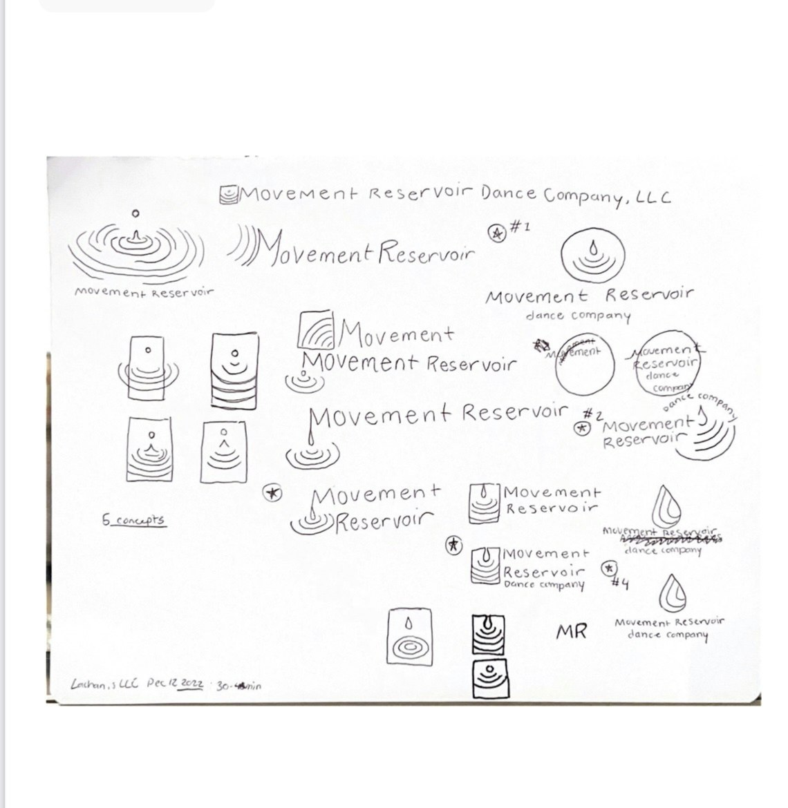
MRDC (Movement Reservior Dance Company) wanted to find a way to express their purpose as local community artists, simply yet uniquely. The concept of a Reservoir led the Company Director and me to investigate a motif that would embody the brand well. The symbol of a water drop and rippling gave voice to what MRDC valued: A single act of acceptance, curiosity, or creativeness in a dance company could create a ripple effect, trickling the same values into the local community.
During the first conversations with the client, it was essential to communicate professionalism and honesty in the digital space. By going for a bold minimalism to complement its existing website colors (wine-red, black, and white), MRDC hit the ground running when it came time to launch social media and an updated website. Visit MRDC's Instagram.
Collaborating with MRDC felt intentional every step of the way. I enjoyed using archetypes to develop a persona during this project. This design process helped me embrace the persona constraints and imagine movement quality and tone when designing font and spacing. For example, the choice to connect the M and R in the full logo became a motif after the client and I designed the approved symbol.
Interested in creating a logo together? Say hello at 616network@gmail.com.